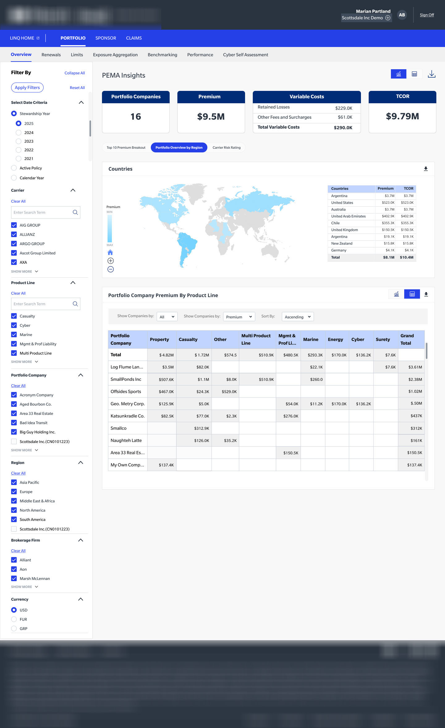
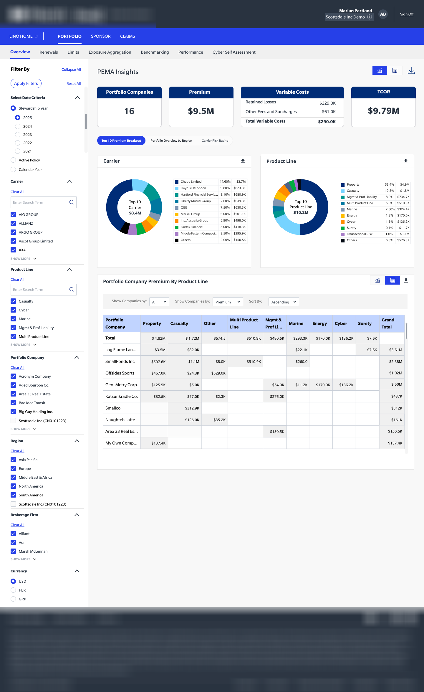
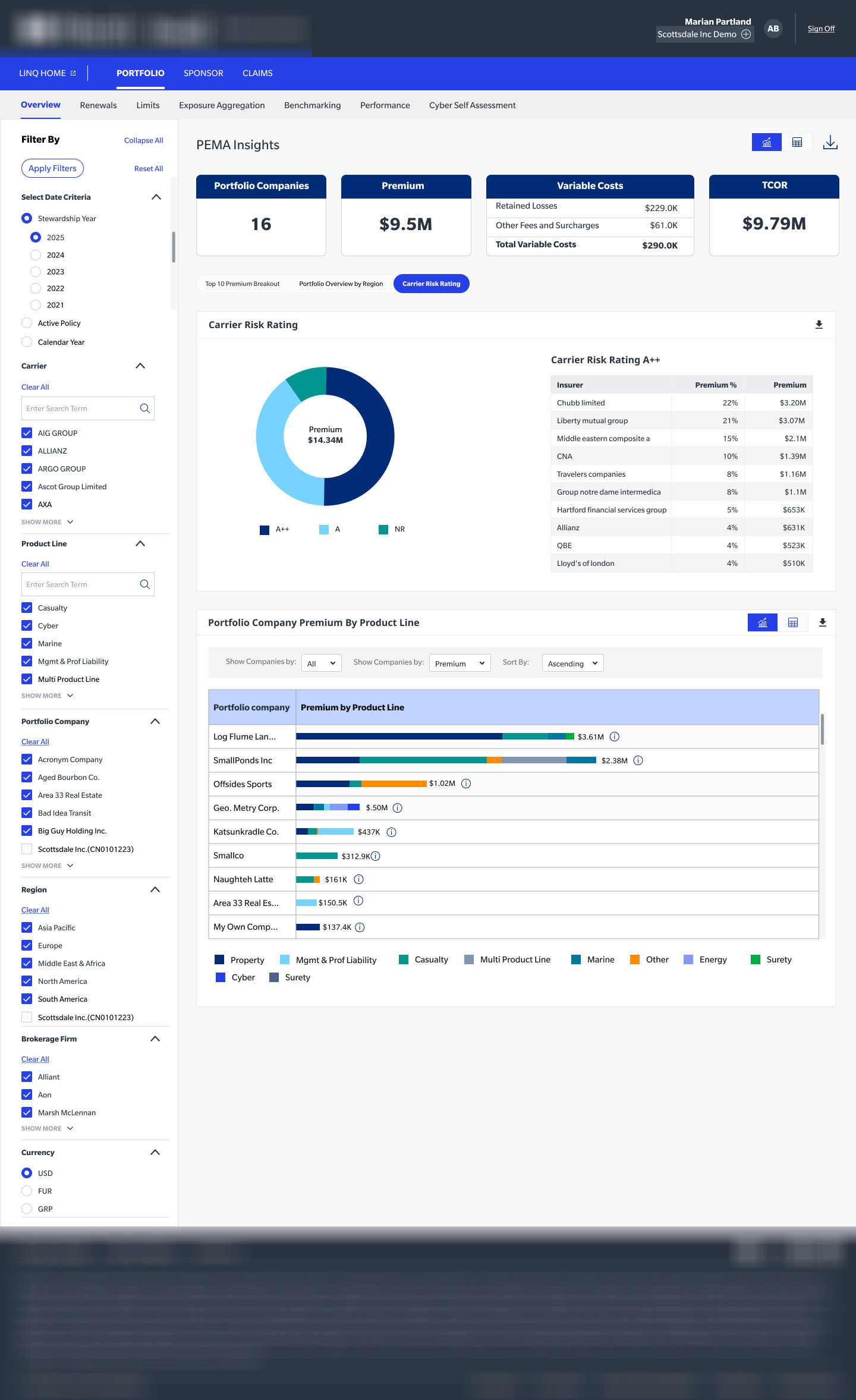
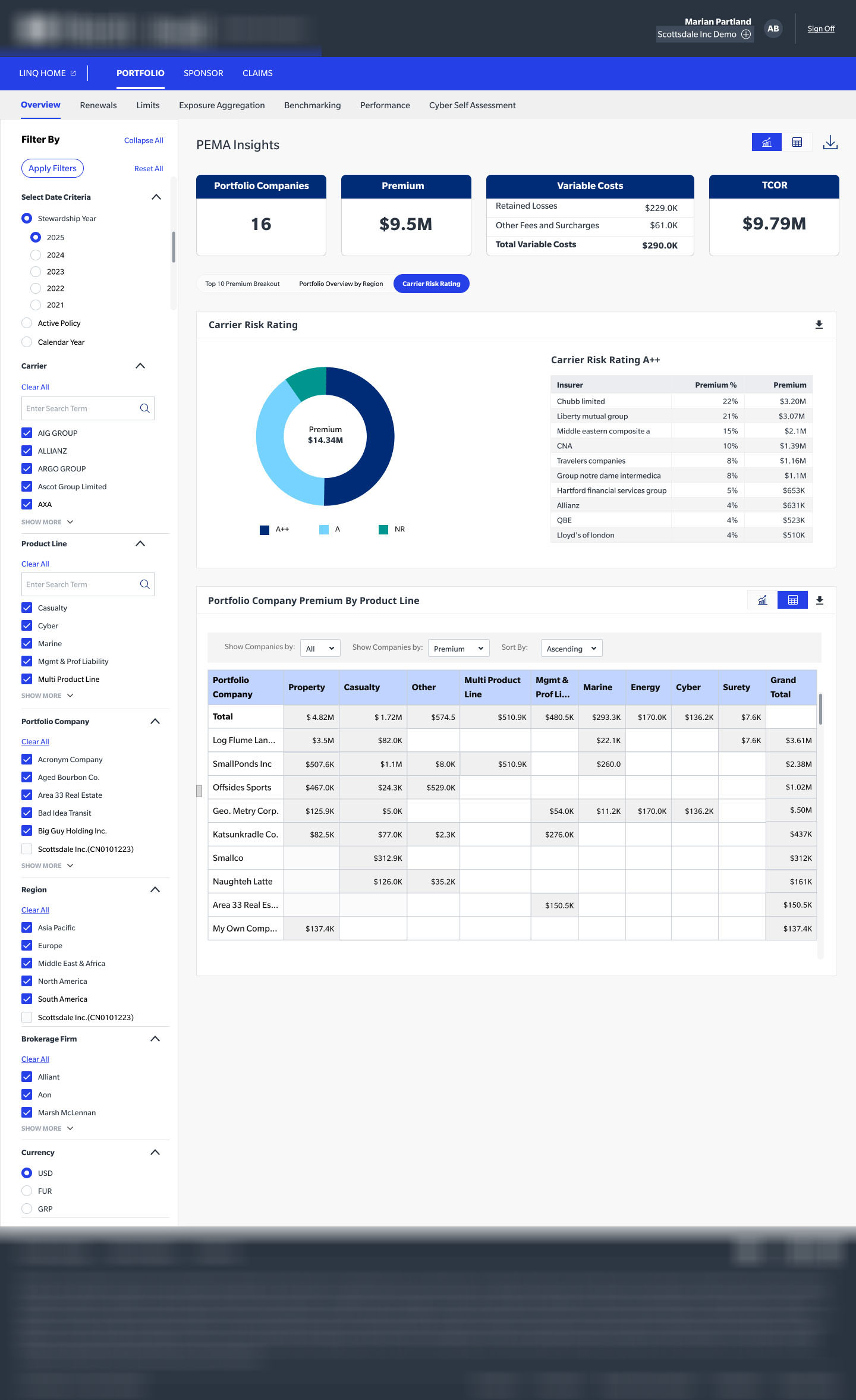
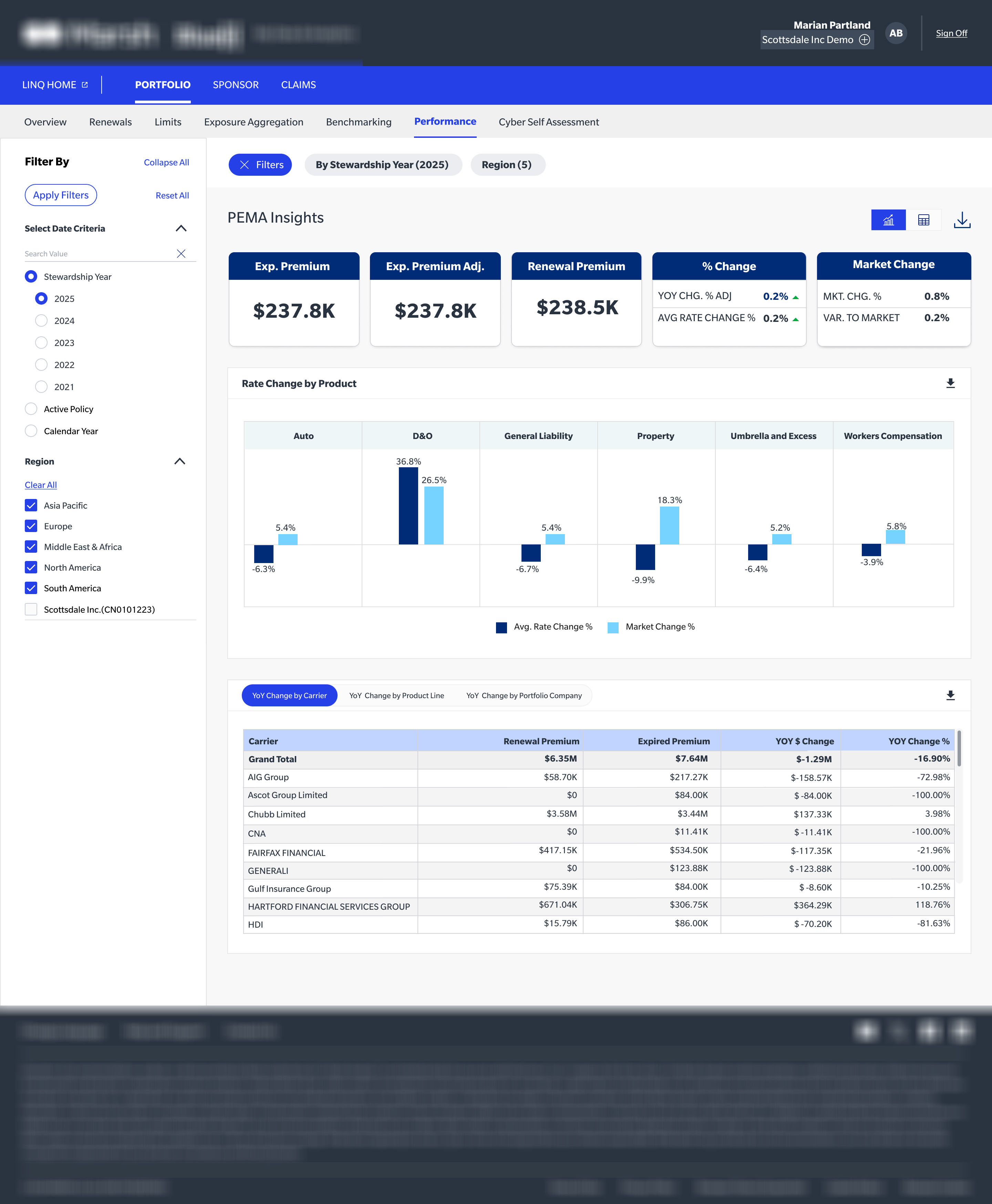
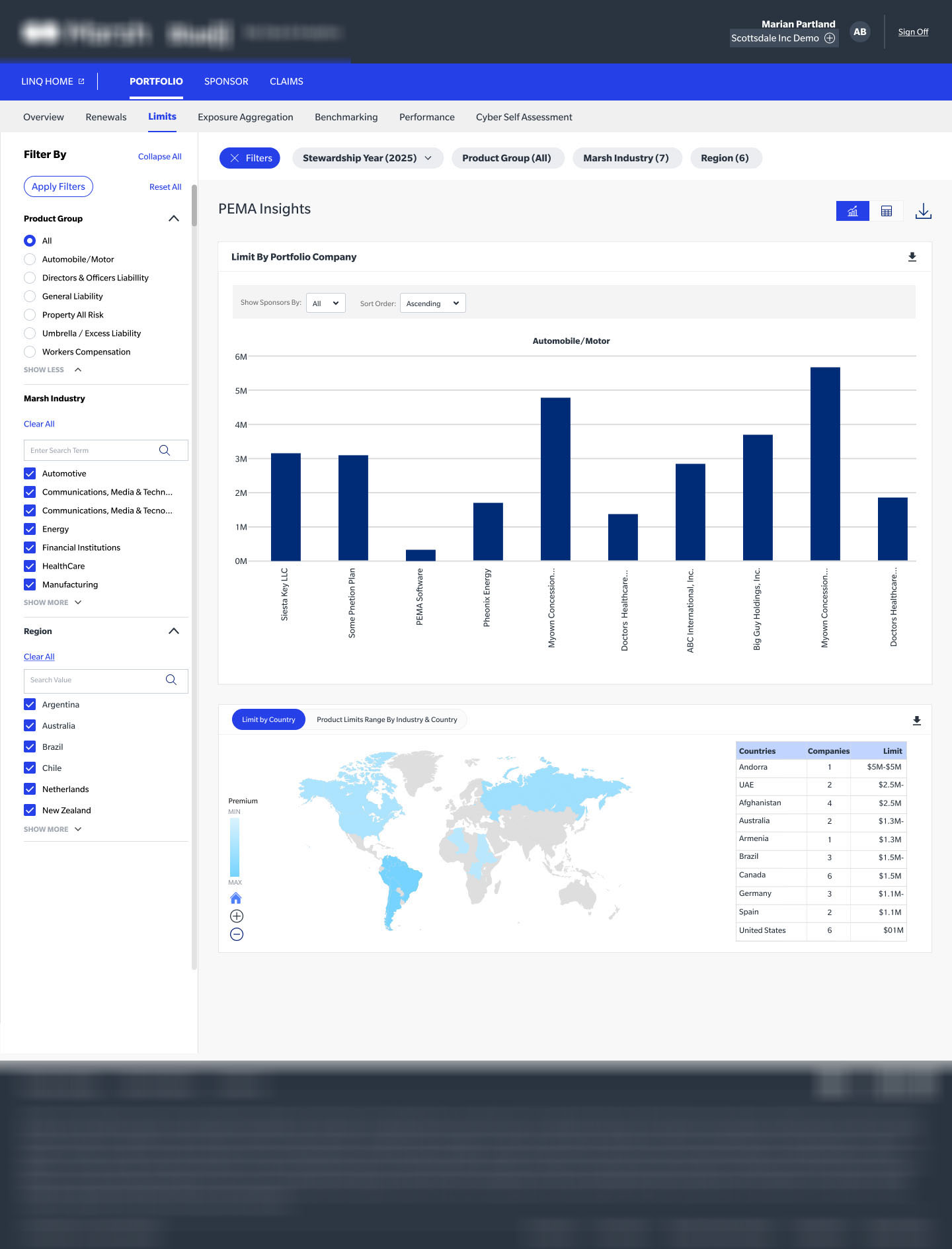
Redesigning Insurance's Private Equity & Mergers & Acquisitions analytics platform — giving PE sponsors complete insurance visibility across their entire portfolio company ecosystem.
Private equity sponsors managing 20-50+ portfolio companies faced a critical visibility problem: insurance data lived in disconnected spreadsheets, email threads, and broker portals across each portfolio company. Renewal decisions were made with incomplete information, leading to coverage gaps, overpaid premiums, and last-minute firefighting every renewal cycle.
The existing Insurance tool was a basic data dump — tables of policy data with no synthesis, no benchmarking, and no actionable intelligence. Users described it as "another tab to ignore." Adoption was below 12% among PE sponsor teams.
"We're paying $200K in premiums at one portfolio company that should be $140K. We only found out after renewal. This platform needs to tell us before we sign."
— Head of Risk, PE Sponsor FirmNo consolidated view of upcoming renewals across 30+ portfolio companies. Teams operated on gut instinct and outdated spreadsheets.
No ability to compare insurance spend, coverage quality, or broker performance across portfolio companies or industry peers.
Policy data, claims history, and broker contacts lived in siloed systems. A single renewal required 6+ tools and 12+ hours of manual aggregation.
I was brought in as the Lead UX Designer to own the full product design lifecycle — from stakeholder discovery through to dev-ready design system and handoff. I collaborated daily with the Insurance product manager, two front-end engineers, a data scientist, and Insurance PE client-facing advisory team.
Key responsibilities included conducting deep-dive user research with PE sponsors and insurance managers, architecting the information model, and designing the entire analytics experience from data ingestion UI through to the executive dashboard.
18 stakeholder interviews, 3 contextual inquiry sessions, competitive analysis of 6 platforms
Information architecture, user journey mapping across 4 persona types
80+ screens from lo-fi concept sketches through interactive hi-fi prototypes
Built a modular component library in Figma used across both PEMA products
I ran a 6-week discovery sprint involving 18 in-depth interviews across three user segments: PE portfolio managers (primary), insurance risk managers at portfolio companies (secondary), and Insurance brokers (tertiary).
Sessions focused on mapping the end-to-end renewal workflow, identifying where time was lost, what decisions felt risky, and what "good" looked like if they could design the ideal tool.
72% of renewal time was spent aggregating data, not making decisions
PE sponsors wanted portfolio-level benchmarks to negotiate better rates
Renewal calendar with 90-day look-ahead was the single most-requested feature
Users needed executive-ready exports for LP reporting on insurance risk posture
Senior VP managing 15-40 portfolio companies. Checks PEMA weekly during active renewal season. Needs aggregated risk signal, not raw data. Decision maker.
CFO or VP Finance at a portfolio company. Uses PEMA to prepare for renewal conversations. Needs company-specific drill-down and historical trend data.
Account executive managing the relationship. Needs to surface insights proactively to the PE sponsor. Values automation and report generation.
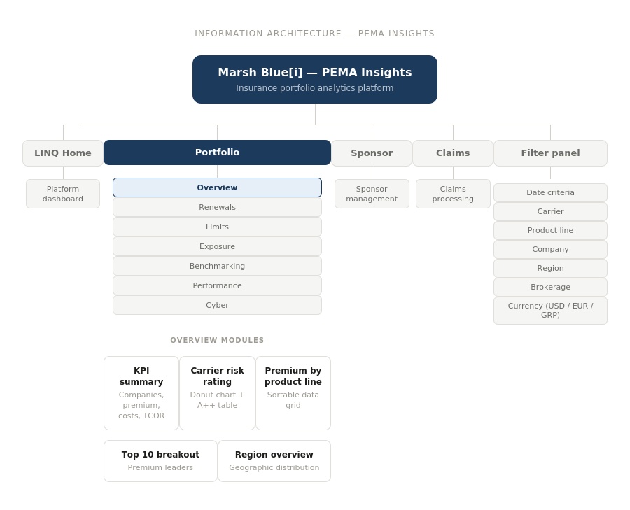
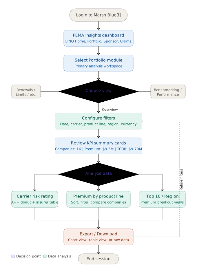
Before touching pixels, I mapped the full product structure and end-to-end user journeys — ensuring every screen had a purposeful place in the hierarchy and every task had a frictionless path.
KPIs, user stories, success metrics, stakeholder alignment
18 interviews, workflow shadowing, competitive teardowns
Sketches, concept sprints, IA workshop with product team
Lo-fi → hi-fi → prototype → design system → dev specs
3 rounds of usability testing with 6 users per round
Analytics review, NPS collection, backlog prioritization
Instead of a generic dashboard, we led with a 90-day renewal calendar. Research showed this was the first thing every user wanted every session. It eliminated the "where do I start" confusion that plagued the old UI.
Every premium figure now shows a peer benchmark — industry average, portfolio average, and historical. Users can instantly see if a portfolio company is over-paying. This was the #1 feature driving the $4.2M savings result.
PE sponsors regularly report insurance risk posture to Limited Partners. We built a templated export that generates a board-ready PDF in under 60 seconds — replacing 3 hours of manual PowerPoint work.
The redesigned PEMA Insights platform launched to 12 PE sponsor firms in Q3 2022. Within 6 months, it had become a core tool in their insurance management workflow — the opposite of the "ignored tab" its predecessor had been.
62% reduction in average renewal cycle time — from 8 weeks to 3 weeks
$4.2M in portfolio-wide premium savings identified in year one via benchmarking
3.8× increase in weekly active users vs the legacy platform baseline
94% CSAT in post-launch survey — up from 31% on the previous tool
3 hours saved per LP report via automated PDF export feature
2 new enterprise clients won citing the analytics platform as a differentiator
"This is genuinely the first insurance tool I look forward to opening. The renewal calendar alone saved us from a catastrophic coverage gap last quarter."
— VP Portfolio Operations, PE Sponsor (Post-Launch Interview)The biggest design insight was that the homepage is a decision surface, not a data display. Users don't want to see everything — they want to know what needs their attention right now. Anchoring the design around the renewal calendar transformed a passive reporting tool into an active workflow tool.
I'm open to senior Product/UX Design roles or consulting engagements.